This data interpretations quiz is slightly different from the others. Rather than focus on one technique, the questions all refer to a single figure from a published paper picked (somewhat at random) to highlight some key concepts relating to data interpretation, experimental design, data processing and presentation, and a few techniques-based questions. In other words, it is all about putting together the knowledge from core lab skills into a real-world relevant context. The plan is to add some more quizzes like this one, so bookmark this page or follow the blog to stay updated. Right, onto quiz 1.
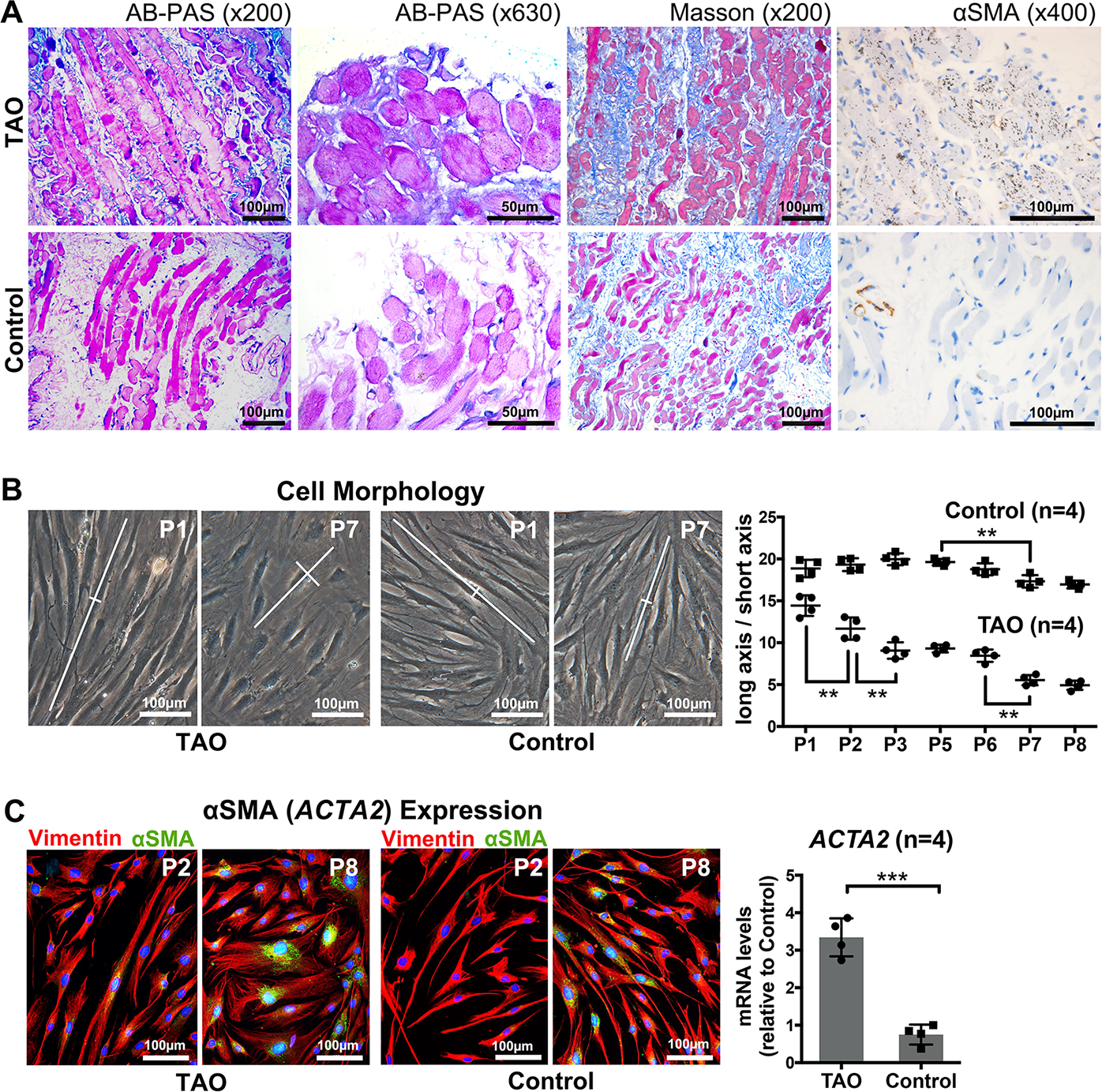
The following questions all refer to the figure below, taken from this paper (opens in new tab). “PH20 Inhibits TGFβ1-Induced Differentiation of Perimysial Orbital Fibroblasts via Hyaluronan-CD44 Pathway in Thyroid-Associated Ophthalmopathy” by Ruiqi Ma; Hui Ren; Binbin Xu; Yun Cheng; Lu Gan; Rui Zhang; Jihong Wu; Jiang Qian published in Investigative Ophthalmology & Visual Science April 2019, Vol.60, 1431-1441. doi:10.1167/iovs.18-26268 (this is published under the creative commons 4.0 license which allows me to share it here without breaching copyright.)
This is figure 1 of that paper. Have a close look and answer the questions below (the image is repeated beside the questions so you don’t have to keep scrolling up)
Some quick background; TAO is an autoimmune disorder where the typical pathological changes are extraocular accumulation of hyaluronan (HA) between muscle fibres and extension of fibrous strands in the interstitial space.
According to the intro “little is known about the interplay between HA accumulation and fibrotic progression during TAO pathogenesis”. Therefore, this study ” aimed to explore the effects of PH20 (a hyaluronidase) and HA on TGFβ1-induced differentiation in pOFs cultured from thyroid-associated ophthalmopathy (TAO) and control subjects.”
Figure 1, like in many papers, is all about setting up the rest of the study, establishing the main study question and model systems.
Quiz – Panel A
Figure 1A is histology staining; AB-PAS staining for Hyaluronan (HA) in blue, Masson staining looking for collagen in blue, and immunohistochemistry for αSMA (smooth muscle actin) in brown. Simple question to start, what can you interpret from these images? Select all that apply.
There is more HA and collagen staining (blue in left three columns) in the TAO sample compared with the control sample.
TAO samples display more HA, collagen and αSMA than control samples
This is a single sample, you can’t make generalisations about a population based on one sample only.
There is stronger reactivity with the anti-αSMA antibodies staining in the TAO sample than the control sample.
this is almost OK, but “stronger” here doesn’t really work. Where there is αSMA staining in the control it is quite brown i.e. “strong” however, there is less overall areas that are stained. Therefore a quantitative word would be more appropriate.
There is more widespread anti-αSMA antibodies staining in the TAO sample than the control sample.
Why have the authors not quantified anything? Why only one sample? Think of some answers then click the answer button below to see if you agree with my interpretation
Answer: one sample only
This information is already well known. Indeed, the authors describe it as ” These findings, consistent with previous studies,16,17 confirmed …” So, why include it at all? Well two reasons, first validation of previous work is important and second, it provides context for some of the work that will be described next. They didn’t need to include it, but by having the images in this paper too, the readers will get a more complete picture which will help them tell their story.
Answer: no quantification
It is quick tricky to quantify this sort of data well. However, you would usually want to convert qualitative data into quantitative data whenever possible to allow you to make generalisations and stronger inferences. My interpretation of why not quantify here is that they had no intention in doing any inferential statistics (there is only one sample after all), therefore leaving the data purely as qualitative is appropriate. Click on the other answer for the rest of the reason why quantification wasn’t strictly necessary here.
The authors write “These findings, consistent with previous studies,16,17 confirmed that aggregation of HA, collagen, and αSMA contributes to TAO myopathy.” in their results section. Is this a reasonable interpretation of these data?
Yes
Nope. Have a think why I don’t think this is right, then hit the other button for my explanation.
No
The problem here is the combination of “confirmed and “contributes”. Together they imply a clear cause and effect relationship. The type of data presented is purely correlative, we cannot rule out something else (a third variable) isn’t causative, neither can we rule out reverse causation. Note, I don’t think this is the case. The point I am making is that you shouldn’t over interpret the data.
As a reviewer of this manuscript is there any comments you would make about the way panel A is displayed?
Looks good
compare the aSMA images
I have some concerns
We are supposed to compare the staining intensity between the top row and the bottom row, however in the aSMA panel the background is much “browner” than in the bottom. Does this mean that the images have been processed differently? In addition there are some minor points that I would get my students to address if they gave me this fig: the two different zooms of the HA are of different regions plus I am not sure the value of showing both? There isn’t really any point in telling the reader the zoom level (x200 etc) as we don’t know what size the images will be printed/displayed at; the scale bar is sufficient to tell the reader the size. The font on the scale bar is too small (usually font 6 or 8 pt is the minimum, better to have them all the same length and then defined in the legend.
Panel B
On to panel B – microscope images of live fibroblasts derived from TAO or control patients.
In panel B, we see brightfield images of fibroblasts after culturing. For each cell in the dish the authors have measured the aspect ratio, the length divided by the width. They interpret these as showing that the TAO fibroblasts are fatter (lower aspect ratio) than the control fibros. Based on the images, I agree with the interpretation. However, from the images it is hard to see precisely where cell boundaries are which would make the scoring more difficult and less accurate. If you wanted to do this experiment but wanted to make it easier for yourself while also making your scoring more precise what could you do differently? Think of your answers and then click the options below to see if they match mine.
Option 1
Lower cell density. Simple, easy and needs no extra equipment. If the cells were less packed then you could more easily see where the edges are. But, would this affect the cell shape? Is the cellular phenotype only relevant when the cells are at confluency? If we assume, yes to these questions then you will need to try a bit harder. Check out options 2 and 3
Option 2
Use a contrast enhancement to help to see the boundaries; to stay with live cells on a dish, you could use a different light imaging modality – phase contrast or differential interference contrast (DIC). Phase contrast imaging, as the name suggests, enhances the difference between phases. Here between the cytoplasm and the media in the dish. You do end up with a halo around the edges but the enhanced contrast could help. For DIC, the optical path length generates the contrast, it’s a really good technique for establishing the edges but requires polarized light sources so not all microscopes/objectives are capable. If the contrast was good enough, you might be able to automate the analysis. However, to be sure, you could choose option 3 instead.
Option 3
Use a fluorescent contrast enhancement and fluorescent imaging. If you look at panel C, the authors have stained their cells with antibodies against vimentin and you can now see the cell shape much more easily. Vimentin is a cytoskeletal protein that basically fills the cell. The dramatic contrast would make delineating one cell from another easy. So easy indeed that the analysis could be easily automated in imaging programs such as FIJI. The potential disadvantage of this is that the cells are now dead and the sample processing takes a bit longer (although automating analysis more than makes up this time). It would be possible to do something similar with live cells, there are lots of cell-marker fluorescent dyes that basically stain everything and again would enhance the contrast.
According the methods, the images were taken at 10 randomly selected fields of view per dish. Each field of view would have about 20 cells that would be measured. They had four different flasks of cells for the TAO and 4 for the control group. How would you process those numbers?
use the 800 measurements (10x20x4) for the TAO group and the 800 control groups in your statistics tests.
determine the average from each field of view then, use the 40 TAO (10 fields x 4 flasks) and 40 control group in your statistics tests.
determine the average from each field of view, then the average from the 10 fields for view for each donor. Use the 4 values for the TAO group and 4 for the control group in your statistics test.
This is about “independent experimental units” the 200 cells measured per flask are clearly living in the same environment, have the same source etc, they are related to one another. Therefore anything that affects one cell will likely affect the others. It is inappropriate to consider them as independent. Here, I am assuming that the four dishes have come from four different donors rather than one set of cells split into four. This leads to the question “why measure 200 cells per flask if you only use 1 value in the end”. That is a reasonable question, the 200 measurements are defined as technical repeats, you use them to be confident that the one value you use is an accurate number from the whole plate. But do you need 200? That depends on the variability within the plate. There is diminishing returns in these types of experiment, measuring 100, 50 or even 20 might be sufficient. If the analysis was automated then doing more would make sense as there would be no cost (fiscal or ethical) in this case, however, if it cost time money or would lead to additional harm to people or animals then I would be looking to reduce the number of technical repeats as far as appropriate
In the graph, the authors have compared the aspect ratio between the control and TAO group but they also wanted to know if there difference after different times in culture (measured here as “passages”). What stats test(s) would allow them to determine how likely the observed differences were due to a type I error (a false positive)? (assuming normally distributed data)
Chi squared test
this would be for categorical data
linear regression
You would use this if you wanted to compare slopes i.e. comparing the line of best fit following the two populations. It could tell you the difference between treatments but not the difference between the individual passages.
1-way ANOVA (followed by a post hoc tests)
Sort of OK, but not really what is needed. The one way ANOVA will compare all the populations against each other and work out if there are any that are different. A post-hoc test will then allow you to determine which pairs are different from one another. This would work, but would reduce your statistical power.
2-way ANOVA (followed by post hoc tests)
probably the best. The ANOVA would test whether there was a difference between group 1 (all the TAO) and group 2 (all the control) samples, the post hoc test would then allow you to test within the groups.
Panel C
Panel C – indirect immunofluorescence microscopy (left) and RT-qPCR looking at alpha smooth muscle actin levels.
In panel C, the authors want to show that there is increased aSMA expression in passage 8 cells compared with passage 2 cells, in both the TAO and control populations. To do so, they have stained their cultures with antibodies against vimentin (a cytoskeletal protein), shown in red, aSMA (shown in green), and DAPI to stain the nuclei (shown in blue). Can you think why they stained for vimentin? As usual, have a think, then check if you agree with me (the authors don’t mention the vimentin at all)
I know the answer!
To show that the cells are fibroblasts, or at least that they express vimentin which you would expect these cells to make. The cells could have differentiated in culture, or they could have been contaminated with another cell type, therefore the vimentin stain is one way of showing the cultures are still relatively “pure”. But is it valuable. Click the other answer to see the rest of my thinking!
I am not convinced it helps the story.
The vimentin stain makes it harder to see the green. If I wanted to show vimentin positivity (see the other answer for why I might), then I would probably have put those data in a separate panel or in supplemental figures. In this panel, all I need the reader to see is the aSMA stain to tell my story. The DAPI+sMA would have been sufficient
There is a data display problem with this panel. What is it? Clue: this is from an eye and vision journal.
I know the answer!
The authors have chosen to show their image using red and green pseudocolours as only an overlaid image. You see lots of images like this; however, about 10% of the male population is red/green colour blind so choosing to use this colour scheme means about 1/20 people will not be able to see the images. The best thing to do would be to show each channel as a separate black and white image and then use colour blind friendly colour schemes in the overlay (if necessary). This is true for all images but the fact that the authors work on an ocular disorder and publish in an eye journal makes this example particularly bad!
Panel C – graph
In the graph in panel C, the authors have present RT-qPCR data looking at ACTA2 (encoding aSMA) expression. The Y axis is a bit vague/confusing so we check the figure legend and it says “Quantitative PCR revealed that the TAO group expressed higher ACTA2 (encoding αSMA) than the control group (t-test, P = 0.0001).” So, we head to the methods; “Total RNA was extracted with TRIzol (Invitrogen) from TAO and control pOFs and reverse-transcribed to cDNA with a rtPCR kit…Real-time quantitative PCR was performed on a real-time PCR System (ViiA 7; Applied Biosystems, Foster City, CA, USA). Primers are shown in Supplementary Table S3. The amplification efficiency was evaluated by the standard curve method, and the mRNA level was normalized to GAPDH by the −ΔΔCT method.” Still not very clear… not exactly up to the MIQE guidelines.
The mean of the control group “relative to the control” group is below 1. How is this possible?
I don’t know
Well,I agree, it should be obvious but isn’t. If they chose one control value as the single value to compare against, then it would be possible that the other three all had lower values. But genuinely that seems like a weird thing to do. I would have calculated the dCt to my GAPDH for all my 4 control culures then used the mean of that number as my normalisation point for the ddCt. When I plotted the graph, the four values would be spread around the mean and the central tendency would have been 1. If they did that and it wasn’t 1, then clearly the data aren’t normally distributed
I know
I am making assumptions here, but I think they might have only done a dCt and not the ddCt as written in the methods. So the “control” in the Y axis refers only to the GAPDH level. This is OK but a little weird and should be much clearer (if it is the case!). Why do I think this is weird? Well the reason to do the experiment is to compare the values between the populations, the expression relative to GAPDH isn’t interesting in itself, so better to do ddCt and talk about fold difference between population 1 and 2
The authors have used the levels of GAPDH as a reference transcript within the samples. In the results, this is described as revealing a 4.46-fold higher ACTA2 expression in the TAO group than in the control group. If you ran 1 more TAO vs control sample, which of the following results would be consistent with those data?
dCT to GAPDH. TAO = 20-22 = -2, Control = 21-21 = 0. Therefore there is a 2 cycle difference, which means a 4 fold difference. The TAO value is lower than the control which means that it has crossed the threshold earlier, meaning there is more in the TAO sample. 4 fold more is quite close to the stated 4.46 fold from the previous samples, certainly within biological variability.
It was probably fine to use GAPDH, however it assumes that its levels do not change in the disease conditions. Let’s play devil’s advocate and say that in TAO, GAPDH expression increases to 10x higher than normal. What would that mean for the data presented in the papers?
ACTA2 expression in TAO samples would actually be about half that of controls
its important to check your reference transcript don’t change. Most people would recommend testing multiple different reference transcripts rather than just picking one
It would have no effect on the interpretation of these data
using GAPDH to normalise means that if it changes, then the interpretation of the other part changes too
ACTA2 expression in TAO samples would actually be about 50 times higher than controls.
you’ve gone the wrong way! If there was more GAPDH expression in TAO, then it would look like there was more ACTA2 even though there was actually less
End of quiz. I just want to say that I didn’t pick this because I hate it, I’ve been very critical here. My comments don’t mean the conclusions are wrong, I have made them to help you to identify where there are problems that you might otherwise have missed. I encourage you to be just as critical about your own work.
Did you find this stimulating? Useful? Do you want more of this sort of thing? Comment below and share if you think it can help others. I’d also welcome suggestions for (relatively recent) papers to do something similar with – must be available to share without breaching copyright.