


You know in school when you were told to make a poster and you wondered why you needed those skills? Well, it turns out that if you are a scientist you probably will end up making a lot of posters in professional situations!
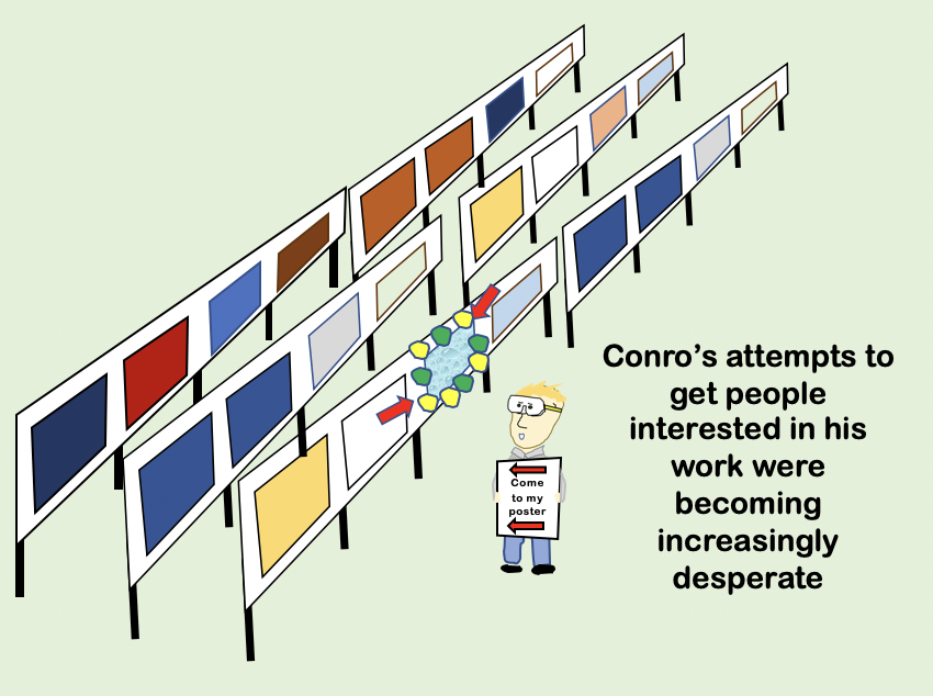
At scientific conferences there are not enough slots for everybody to talk, therefore, the organisers will arrange poster sessions to allow everyone to have a chance to present their work.
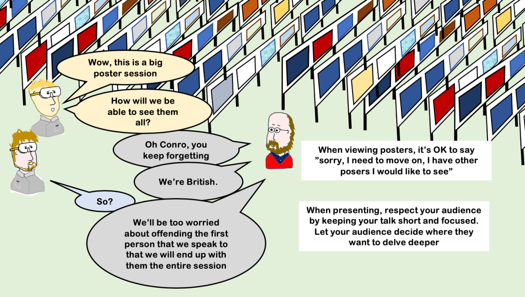
Poster sessions can be a really effective means of getting a deep, in-depth, interaction with people who really do care about your work. They present a chance to speak 1 to 1 with some of the experienced people in your field. Hopefully, you will get some useful feedback and ideas for further work. Often it is in front of a poster that new collaborations are born. Indeed, they are so useful that some conferences allow you to present a poster in addition to your talk.
This page will help you make the most of poster sessions by ensuring your poster has maximum impact.
1 poster, 2 jobs
A quick point before we begin. Your poster may have to do two jobs. Firstly, it will be a visual aid for you to discuss your data with others i.e. it’s basically the contents of a presentation. Secondly, it might have to stand alone and present your work when you are not there to talk about it. At most conferences your poster will be up for extended periods of time and you will have a time slot to formally present your work.
The good thing is that most of the things that will lead to a good poster will be the same for both roles. However, it’s worth having this point in mind while you are deciding what you need to include.
Content and structure
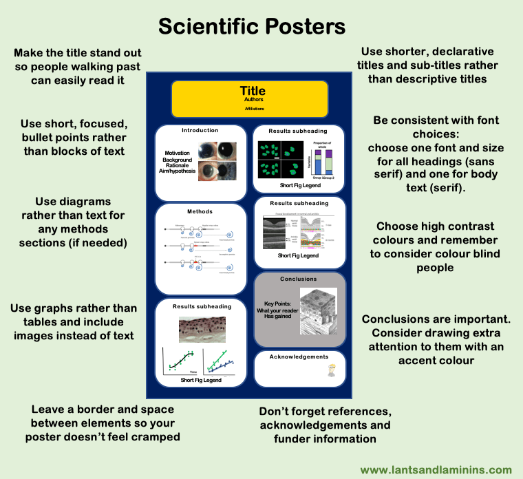
A scientific poster will contain all the contents of a research paper but these elements will be (primarily) delivered in pictorial form. Your poster will have all the elements you’d expect in a paper; title, authors, motivation, background and rationale, aims and objectives, materials and methods, results (the biggest part), discussion, conclusions and references.
The challenge is to design your poster so that you can deliver your story in a way that people will want to interact with, and which can allow casual viewers to take away the main points in about five minutes.
Big Tip
You may not be able to present everything. Focus on the big picture.
In practical terms, to keep your story short and punchy, you will first need to decide what are the most important things you want to deliver. Once you have done that, every subsequent decision you make will be designed to help your reader absorb those main points. This means all the decisions from choosing a layout and adjusting the sizing of the elements to selecting the colour schemes, fonts etc are all done purely with the goal of maximising the effectiveness of your message.
Title

You need to grab people’s attention. Poster titles work best if they are short, simple and definitive.
You want passers-by to quickly identify the topic area of your work and then they will come a bit closer, and linger for longer, if it is potentially relevant to them.
A declarative statement-type title is likely to be more memorable (as usual). Avoid using a question unless you are going to have the answer prominently displayed. Indeed, if you can avoid having any punctuation it’s usually better! There’s an art to picking an effective title, you can have a look at my tips on a separate page: here.
Make your title big and easy to read but do not use all caps.
Layout
The layout of the different elements of your poster should be focused on achieving a clear flow through the narrative, to guide the people looking at it through the story. The order that the different elements should be read should be obvious to the reader (I sometimes number my boxes or have arrows guiding the reader).
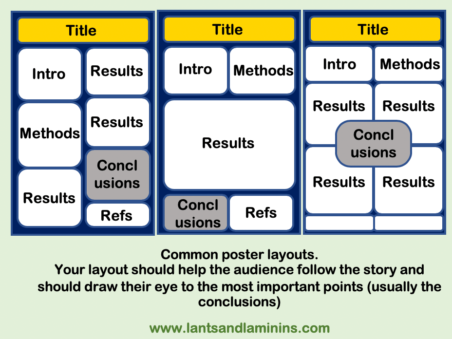
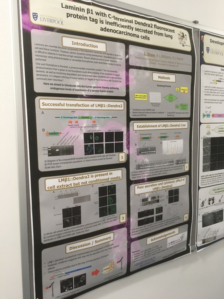
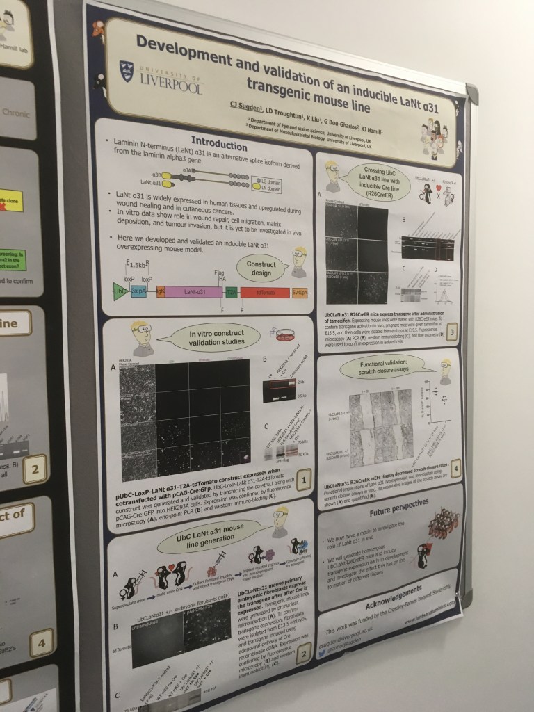
There are lots of ways that posters can work but the most obvious way is to have two (portrait) or three (landscape) columns. The reader then will progress from top to bottom down one column then down the next. Simple. Common variations on this theme are segmenting into boxes; intro/abstract and methods along the top, results in the middle, and discussion, acknowledgements along the bottom (see below).
The simple options, while fine, may not be the best for your data. If you want to make an impact or draw attention to a specific element, you might want to adopt a different approach.
Something you should definitely consider is what will be in the eye line of people walking past. If you have compelling images you could consider having those located centrally to draw people in. You could also draw attention to specific elements by having them encased in a call-out or using a colour switch (e.g. the grey boxes for conclusions in the samples above).
If you break from one of the traditional simple templates, make sure there is a clear progression through the poster, that it doesn’t just feel like a jumbled mess!
Big Tip
Not too much stuff! Good posters aren’t completely full but actually have some white space.
Remember, that whatever layout you choose, you shouldn’t use every little bit of space to deliver information. It is better to have regions of white space that you use to draw attention to the parts you want people to focus on. A poster that is crammed full of info will put people off! As a rough rule of thumb, 40% of your poster should actually be empty! Make sure you have space around the outside and between elements.
Replace text with images wherever you can

People aren’t coming to your poster to read about your work, they are coming to see (and discuss) your work.
Think about ways in which you can cut down the text on the poster in whatever ways you can. Remember, posters are all about delivering the message at speed rather than the minute detail (they’ll get the detail from your published paper).
So, how can you cut down the text?
For your introductions and conclusions, the obvious answer is to use short bullet points rather than full sentences or paragraphs of prose. For your intro; 4 or 5 bullet points that i) establish the motivation, ii) detail the specific relevant background, iii) identify the gap in the literature, and iv) state your aim/hypothesis should be all you need.
Each bullet doesn’t have to be a full sentence, the shorter they are the better. An image to provide context or diagram to establish anything complicated is worth including. Indeed, if you can replace one or more bullet with an image then that is even better!
Big TIp
There’s no point using bullet points if you end up writing full sentences!
Materials and Methods sections are often the worst for being full of text that very few people will read. Wherever you can, use a diagram to replace text. Otherwise, keep focused on the relevant material, use bullet points and short statements. A good option if you have many different approaches (and therefore would have a big block of text) is to use your figure legends to provide experimental detail rather than having a dedicated methods section.
Big Tip
Large blocks of text will put off most people. Find ways to replace text with diagrams / pictures
For your results sections, use figures everywhere you can. Most of the time you can just put in the individual panels you are making for your manuscript anyway (advice here). However, you might need to tweak them a little, for example changing the size of the fonts for axis labels or simplifying presentation to help your audience grasp the point more rapidly.
Big Tip
Graphs are better than tables,
Results sub-headings can be used to establish what the figure shows but, as usual, I suggest choosing a statement of your actual findings rather than a descriptive heading indicating what your question. Make life easier for your reader by telling them what they should be seeing!
Figure legends can go one of two ways. Either go with really short and to the point or use the fig legends to deliver methods as an alternative to delivering methods text.
Big Tip
Most of your data figures will be the same as for publication but simplify them if it will help you deliver your message
Design Considerations
Software
Posters can be easily made in Microsoft Powerpoint or Apple Keynote. Just set the page dimension to the size you will print your poster and then you can go ahead and create your poster quickly and easily. You might even find templates are available to download which will speed up the process.
If you want to take more time and care, and perhaps create a more professional feel, then publishing programs like Adobe Illustrator, Corel Draw or Microsoft Publisher all give you added functionality. They come with the caveat that they might take longer to prepare at first if you are not already familiar with the software but the end effect could be better.
Whatever you use, always do a test print before printing at poster-size and check carefully for random print marks, underlined spelling mistakes etc, those sorts of mistakes are really embarrassing at full size!
Big Tip
Turn on gridlines. They will help make sure that you maintain spacing and align elements

Size and orientation
Be sure to check the instructions. You will have been given information about what size the poster boards will be. If your poster ends up being too big it will spill over the edge and look very unprofessional! Embarrassing! Landscape or portrait; again, check the instructions, don’t just assume it is the same as last time! Before you begin, set your slide or page dimensions so that they fit the conference requirements (you want to be able to work at 100% scale to check for pixelation of images).
Fonts
- Use 2-3 fonts maximum:
- Titles and sub-titles: use a sans-serif font (e.g. Franklin Gothic, Gill Sans, Tahoma).
- Body text use: a serif font (e.g. Garamond, Big Caslon, Minion) f
- Don’t use comic sans (no one will take you seriously). Avoid Calibri if you want to stand out (default fonts are OK but not great!)
- Keep font sizes consistent between the different elements. Suggestions:
- Title: 90 pt.
- Section headings: 60 pt.
- Body text and subheadings: 30 pt.
- Figure legends and references 24 pt (18 pt min).
- Axis and fig labels 18 pt (final size, check after you resize).
- Don’t use ALL CAPS or underlining these are more difficult to read (bold or italics are better for emphasis)
Key Point
Print the poster at A4 size and check that you are able to read everything at arm’s length
Colours
Your colour scheme might be defined by your Institution or Department (hence why the posters below all look quite similar), following some sort of branding is usually enforced when a group of people will be presenting at a large conference. Good news is that there may be pre-existing templates available for you to start from. The bad news is that they might be all that good!
Use one background colour and a maximum of two accent colours. Establish which accent colour is primary (titles/headings) and which is secondary and then stay consistent.
If you know where the posters will be displayed, consider matching the background colour to the lighting in the poster hall. Use a light background for light rooms, and darker backgrounds for darker rooms (most poster halls will be light). An exception; if most of your data are images that are predominantly black on white then consider a darker background to maximise image contrast.


Big Tip
Remember to consider colour blind people: avoid red/ green combinations
Images
Use good quality images, the highest resolution possible. At their final print-size, your images should be a minimum of 150 dpi, any smaller and they may look pixelated. For example, for a 600 x 300 dpi image, the max size for print would be 10 x 5 cm (4 x 2 inches).
Don’t forget to check that any graphs or tables you have inserted as tiffs are also sufficiently high resolution.
Tables
- Better to use a graph wherever possible!
- Use formatting as for publication (there is a reason why print journals use their specific formatting!).
- No vertical lines.
- Horizontal line at top and bottom.
- Horizontal line between column headings and data.
- If you think zebra stripes will help, use very subtly different colours.
Presenting your poster
During the conference, you will have an allocated time period where you should stand in front of the poster and be prepared to discuss or present it to other attendees. These poster presentations can be one-to-one or one to a crowd of people standing around, but either way they are much more flexible and fluid than a podium presentation. As such, you have to be prepared and willing to respond to what your audience wants.
Poster sessions are often judged and there are prizes available. The judges will be looking for clear science, clear communication, and professionalism. The prizes aren’t why you are there, but the things you are being judged on are what you should be aiming for anyway!
Poster sessions are often judged and there are prizes available. The judges will be looking for clear science, clear communication, and professionalism. The prizes aren’t why you are there, but the things you are being judged on are what you should be aiming for anyway!

It is a good idea to have a short spiel semi-prepared. Aim for about 5 minutes to cover all the key points in enough detail to deliver the message.
There might be hundreds or even thousands of posters and people will want to look at many of those posters in the allotted time. If your stock presentation takes 30 minutes, then your audience will be unimpressed.
Give your listeners just the main story then let them probe deeper into the areas where they are interested.
The letting the audience guide you advice holds true throughout your poster session. If a lab head who works in your field is talking to you, you won’t need nearly as much time to detail in the introduction or background (they already know that bit!) and likely they won’t need simple experiments explained in detail. Before you begin presenting, ask a few small questions to gauge where to pitch your story.
Big Tip
Don’t go on too long! Your poster viewers have others to look at too.
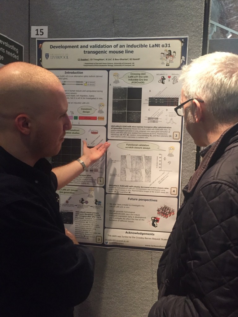
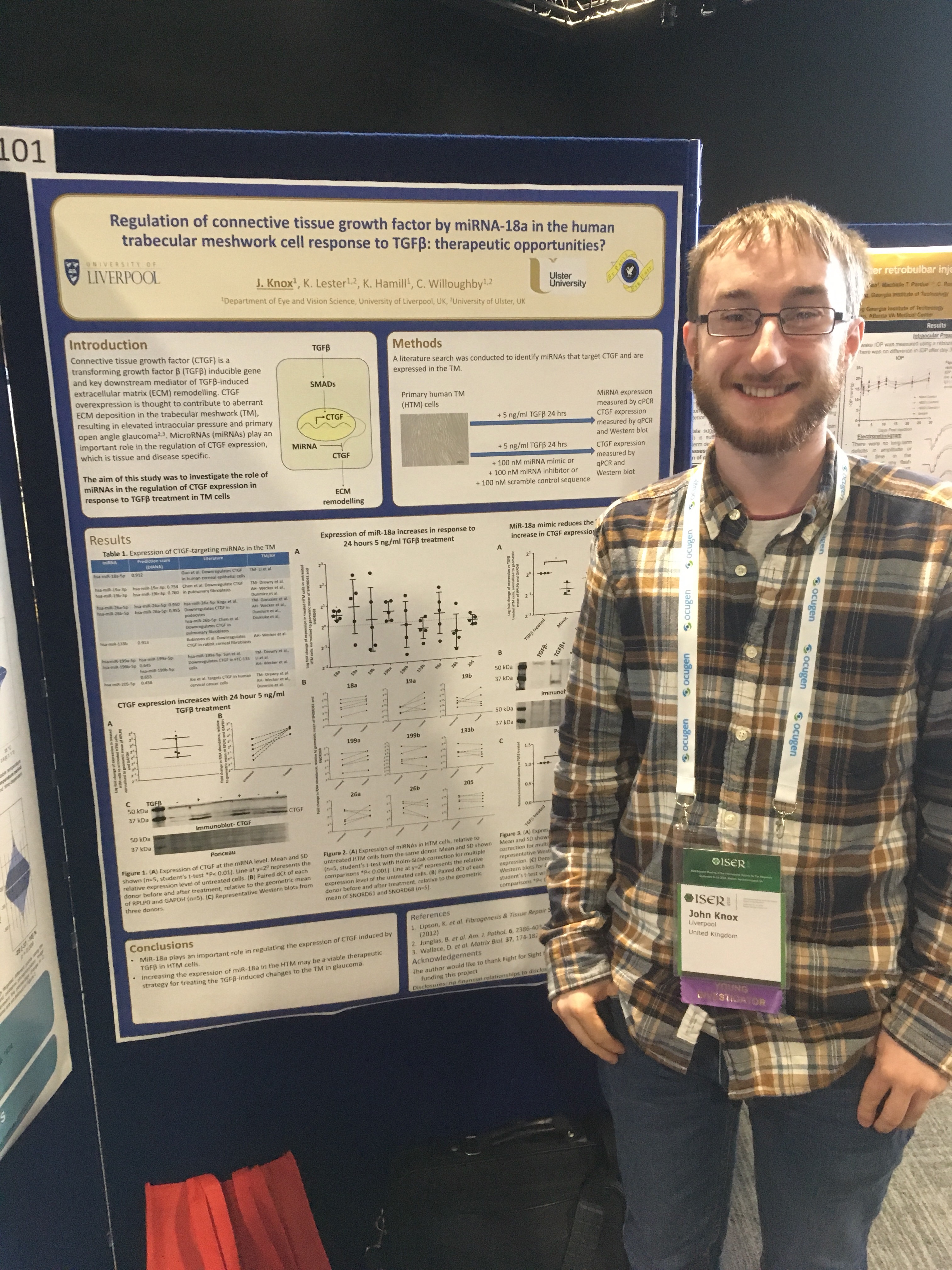
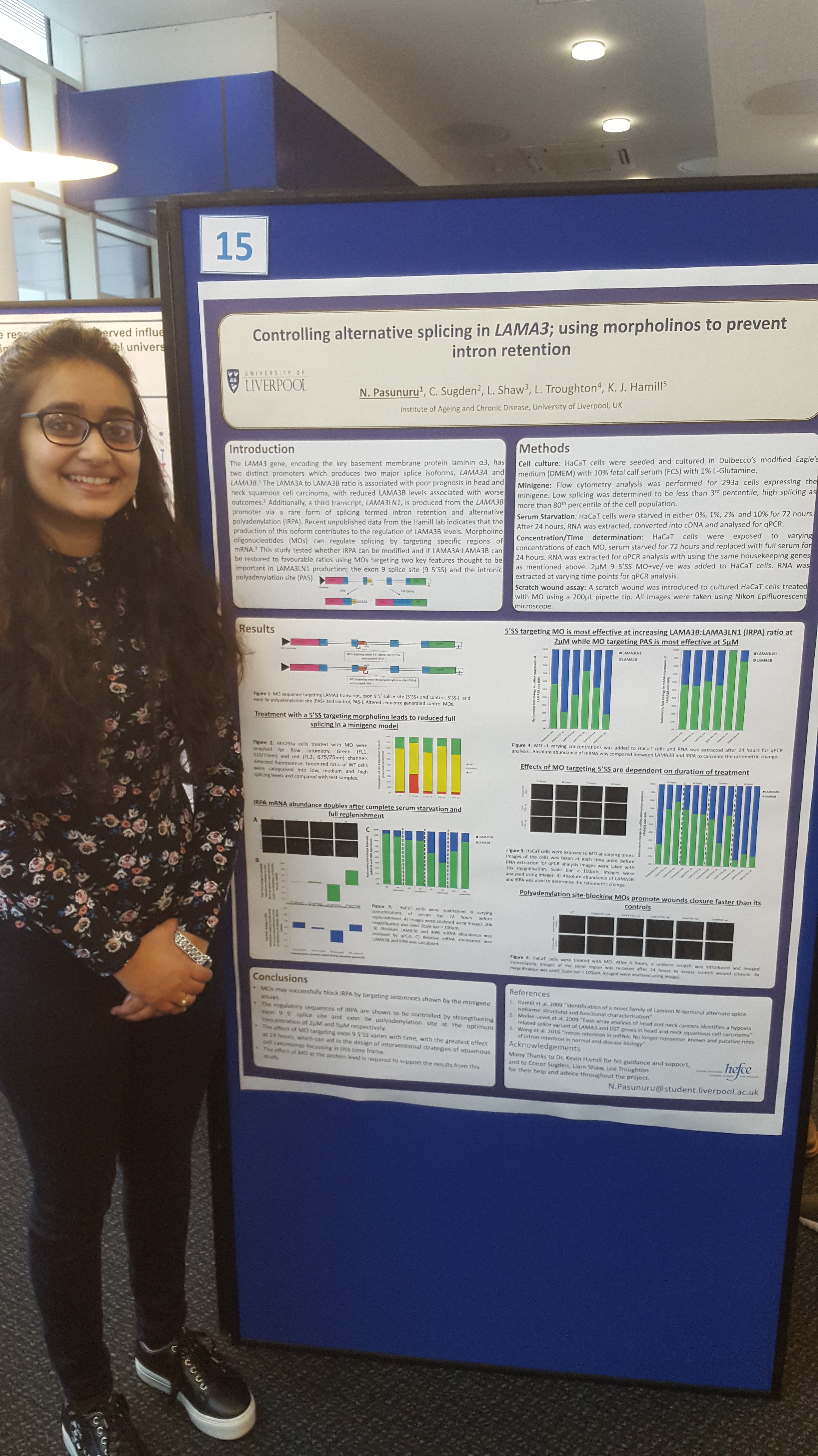
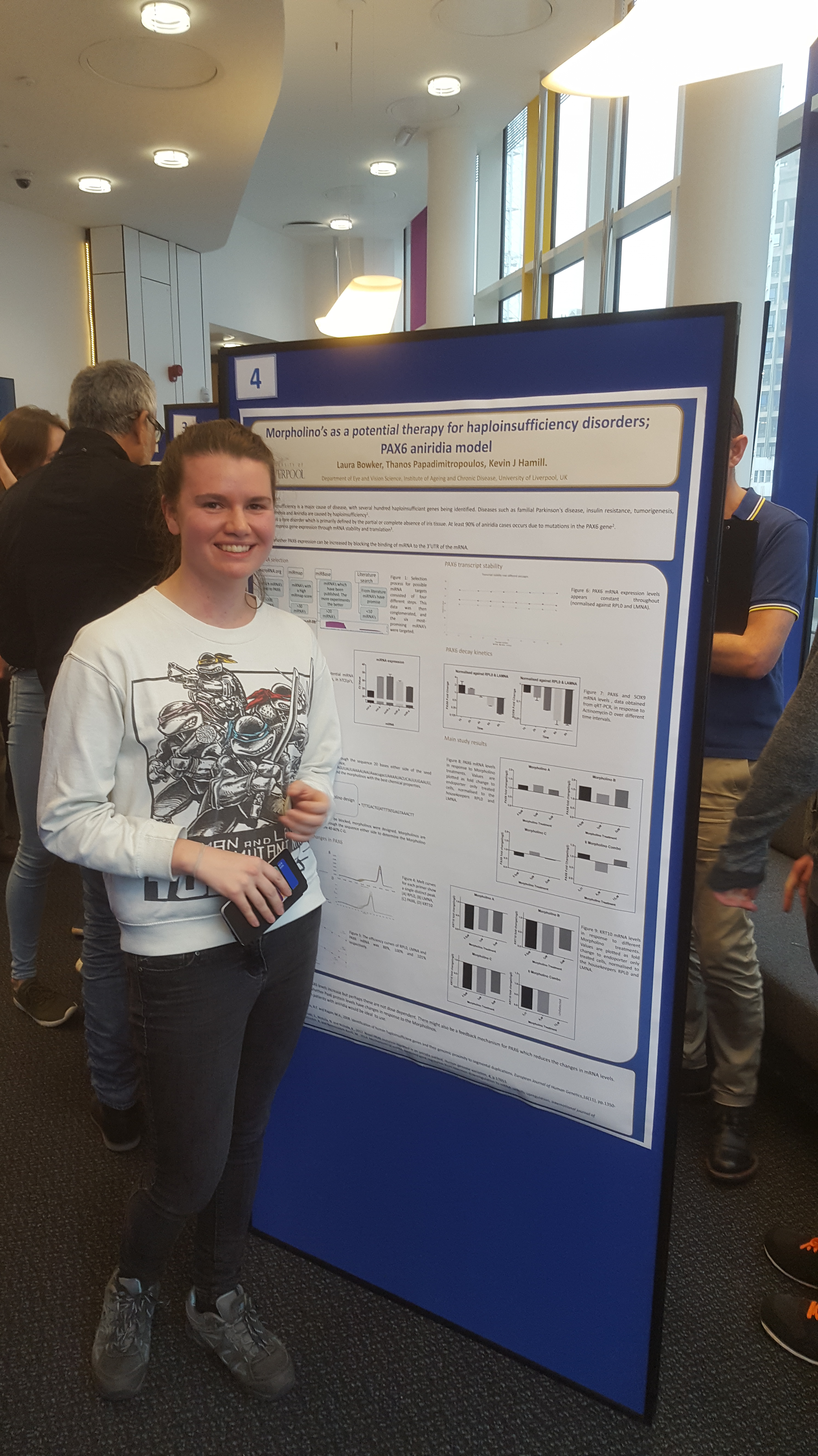
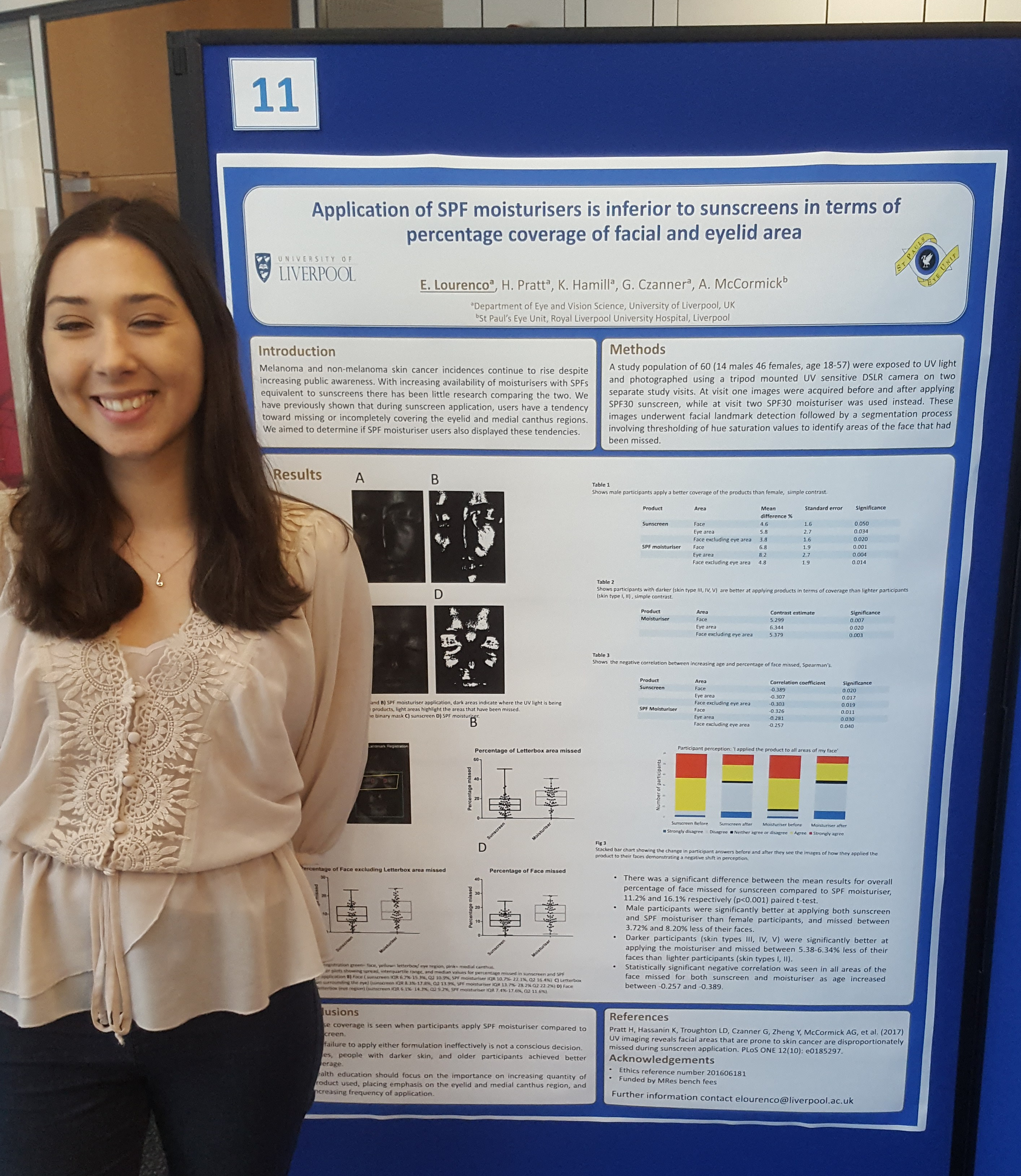
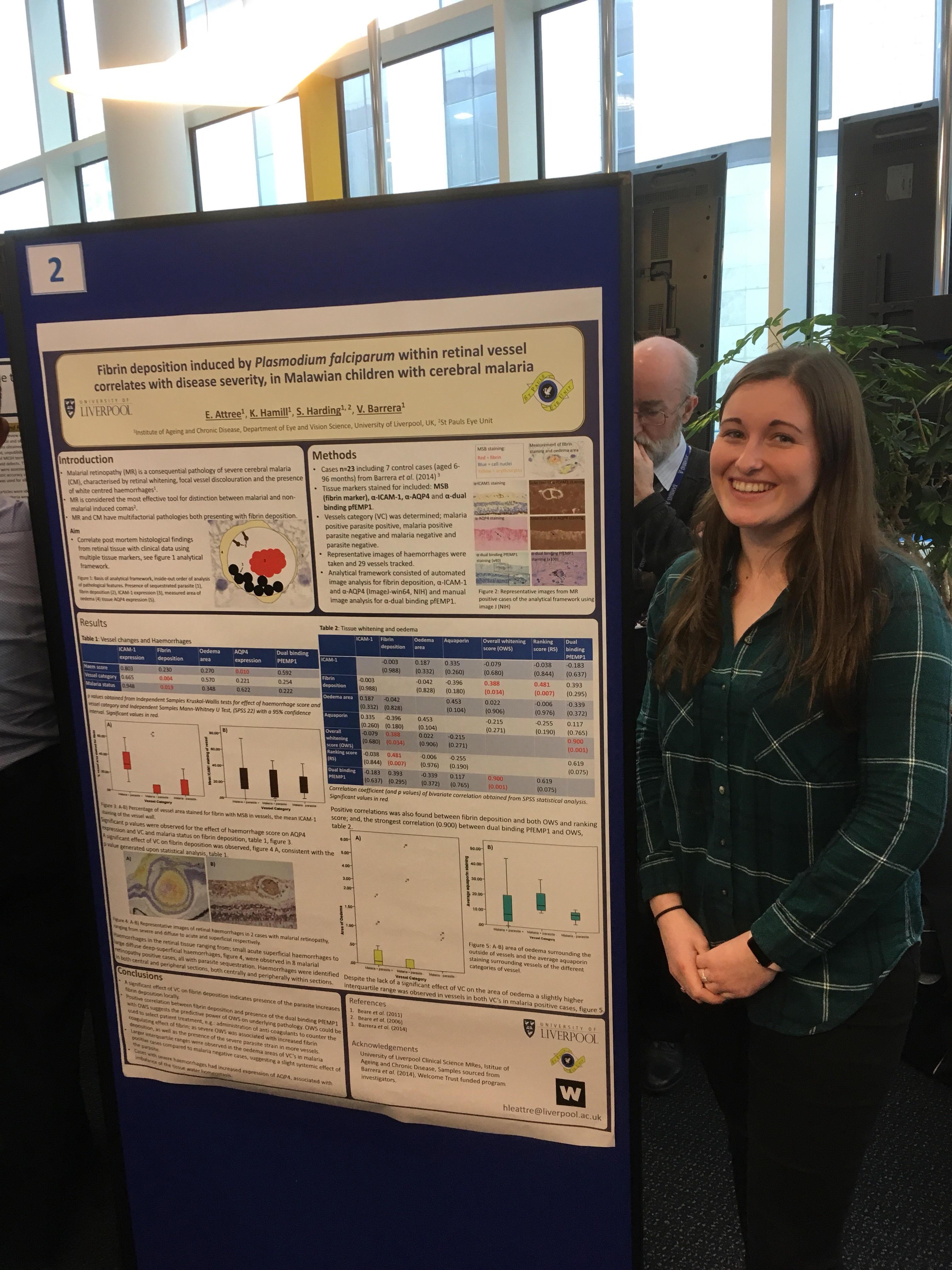
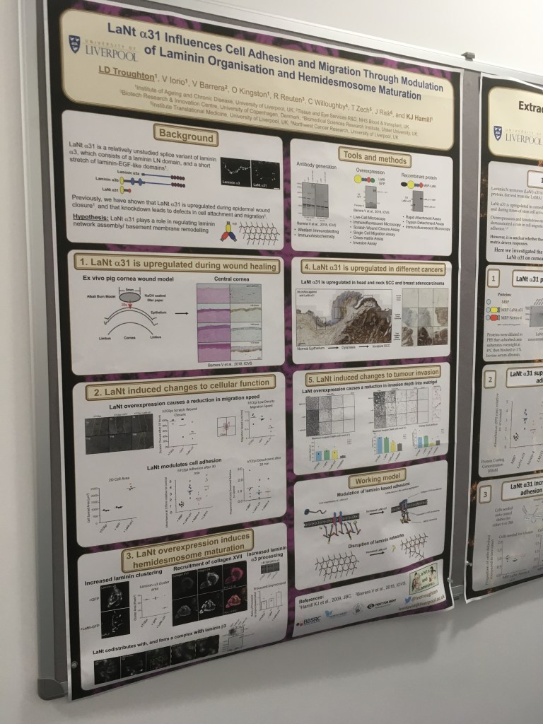
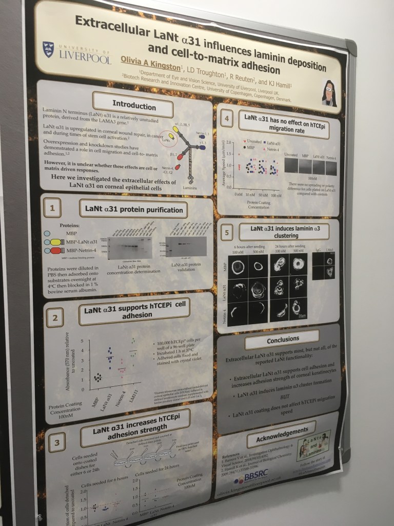
Some more of our recent examples:
I would only do this when your data are actually really robust. You have to strike a balance between showing that you enjoy your work but also that you take it seriously. The poster in this pic was used at a student event that was quite informal and having a mouse army didn’t seem too far!
Don’t just take my word for it!
Here are some more pages to consider:
https://www.the-scientist.com/careers/poster-perfect-42000 S
examples of good design: www.cns.cornell.edu/documents/ScientificPosters.pdf
Graphic design as they apply to scientific posters: Science.nichd.nih.gov/confluence/display/~jonasnic/Elements+of+Style
Blog
Constantly updated resources for better poster-making: betterposters.blogspot.com

Like this page? You’ll love this book! Everything you could need to be successful as a scientist (and super cheap).
