
In flow cytometry, what is side-scatter a measure of?
Granularity
Size
Fluorescence intensity
Density
What do you have to adjust to ensure that fluorescence from one channel doesn’t spill over into the other channel(s)
Compensation
Threshold
Gates
Voltage
What information do you need to know when choosing which fluorophores to use in your flow cytometry experiments? Select all that apply
Which sheath fluid you will be using
The granularity of your target cell type
The lasers and filters available on your flow cytometer
The excitation and emission spectra of the fluorophores
You are performing a flow cytometry experiment with a previously characterised antibody on a new cell type, which of the following controls would tell you if your new cells had autofluorescence in the channel you are studying(Select all that apply)
Your cells processed with secondary antibody only (primary omitted)
Always a useful control to have, but signal here would be non-specific secondary binding
Your cells processed with isotype matched primary antibody (e.g. non-immune mouse IgG) and secondary antibody to the primary
this is a standard control to include alongside any antibody approach, however it controls for non-specific IgG binding rather than autofluorescence
Your cells without any antibody at all
Yup. Correct.
Cells from a different cell type that you know don’t express your protein
Cells from a different species
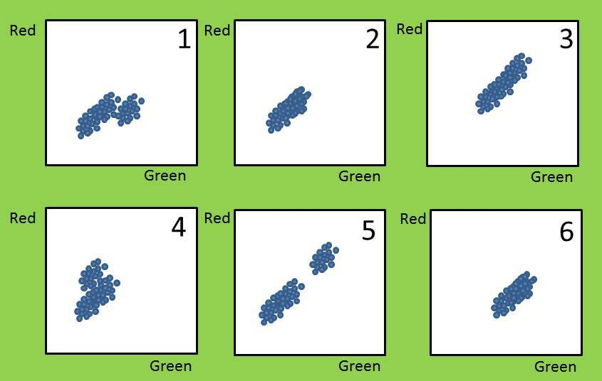
You are analysing flow data. After gating for live cells, you get the above plots.
Q1: Can you identify the isotype-matched antibody controls? (FYI the quiz program randomises the answer order, I would have gone 1-6!)
Plot 2
Yes, assuming minimal binding you would have low red and low green signal with your negative control
Plot 1
Plot 6
Plot 4
Plot 5
Plot 3
You probe your cells with two different primary antibodies, one labelled with a red fluorophore and one with a green fluorophore. Plot 2 is your negative control. Which plot would indicate that a sub-population of your cells expressed the green protein but not the red protein?
Plot 1
Yes, some cells have shifted to the right, i.e. brighter green but haven’t increased in the red direction. Most cells haven’t changed at all, hence sub-population
Plot 6
Plot 3
Plot 4
Plot 5

You probe the same cells with the same antibodies but this time you try permeabilizing the cells before probing them. You get the results above. Which interpretation(s) fit these data?
The antigens recognised by the red antibody are intracellular, the antigens recognised by the green antibody are on the cell surface
Both the red and green antibodies recognise antigens on the cell surface
The green antibody recognises a nuclear protein, whereas the red antibody recognises a golgi apparatus protein.
The green antibody is a better quality mouse monoclonal antibody than the red antibody
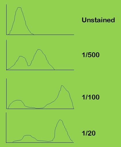
You buy a new antibody and do a pilot experiment where you test a dilution series on a cell population where you expect a mix of positive and negative cells (plots above). Which dilution would you use for subsequent experiments?
1/100
This dilution keeps the negatives with low signal and gives strong signal positives; the best signal to noise ratio. This sort of titration experiment is important to do first, it will make your final data easier to interpret
1/500
1/20
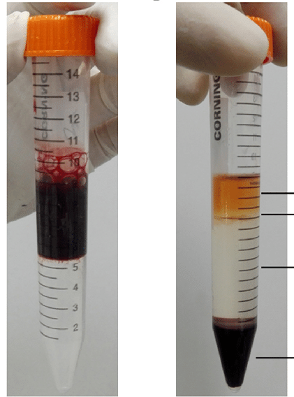
You do a Ficoll separation of a bone marrow sample (above). After centrifuging you get the image on the right. What would you get if you took the top layer?
plasma
I know this isn’t really a flow cytometry question, but flow is used extensively by people studying inflammation/immunity etc so this seemed like a reasonable place for this question!
mononuclear cells
Ficoll
Erythrocytes
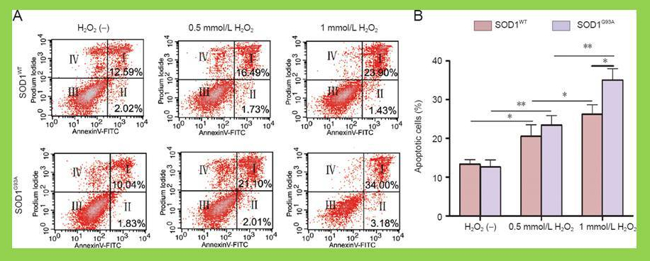
via Neural Regeneration Research Sui et al 2014
In the experiment above the researchers have used flow cytometry to assess for apoptosis in two cell lines in response to 3 different treatments.
Q1. If you were analysing these data, what statistical test would you choose (assume normally distributed data)?
2 – way ANOVA
you have 2 cell lines, each treated in 3 ways. A 2-way ANOVA would specifically ask if the treatment responses were different in the different cell lines.
MANOVA
MANOVAs are for when you have multiple outcome variables, here the outcome variable is just one; % apoptotic cells.
logistic regression
these are used when you have a continuous independent variable such as age of donor and binary outcome variables such as positive vs negative
1 way ANOVA
This isn’t a terrible answer; a 1 way ANOVA would assume that each of the 6 treatments are unrelated to each other. However, they aren’t and moreover, the authors don’t actually care if, for example, SOD1wt H2O2 sample is different from the SOD1G93A 1mM H202 sample. Including those extra comparisons weakens the analysis.
Q2 Propidium iodide and annexinV were used in the experiment above. Propidium iodide is excluded from live cells and enters dead cells. Once inside a cell, PI binds to DNA and signal increases. Annexin V is an apoptosis-related protein.
Based on the representative example in A, which sample has the highest percentage of necrotic cells (necrosis is a form of cell death that doesn’t involve apoptosis).
SOD1 WT, H2O2 –
SOD1 G93A, H2O2 –
SOD1 WT 0.5mM H2O2
SOD1 WT 1 mM H2O2
SOD1 G93A 0.5mM H2O2
Yes, there appears to be a higher proportion of events in the IV quadrant – high PI, low annexin V. Unfortunately the authors didn’t indicate the % positivity there so we can’t be totally sure. I am assuming that they have captured similar total number of events
SOD 1 G93A 1mM H2O2
Q3 How well does their representative example reflect the population means in the graph?
They have chosen an example with a bigger different in the 1mM treatment than is supported by the mean
One of the key messages that the authors wanted to deliver here was that the mutant line was less resistant to high H2O2. The graph did that very effectively. The choice to display the most extreme visual example is unnecessary and a bit that disingenuous. It’s not wrong, these will be data acquired in one of their biological replicates, but you shouldn’t pick the most extreme examples as your representatives in flow or any other type of experiment.
In the example. every sample is less than the population mean
They have taken any cell that is annexin V positive to be apoptotic i.e. added quadrants I and II. Not all are below the mean lines. Many people would have used a different y axis to make this clear e.g. “% apoptotic and pre-apoptotic cells”
The example exactly matches the mean of their experiments
No, it doesn’t, and you wouldn’t expect it to. All six of these plots should have come from the same experiment, you wouldn’t expect every sample within an experiment to match the population mean
All the SOD1wt are lower and all the SOD1G93A are higher than their population means
Like this quiz? Try some of the others via the buttons below:
Also, keep the content coming – buy my book, You should find it really useful if you are embarking on a career as a research scientist

